📖 5 min read
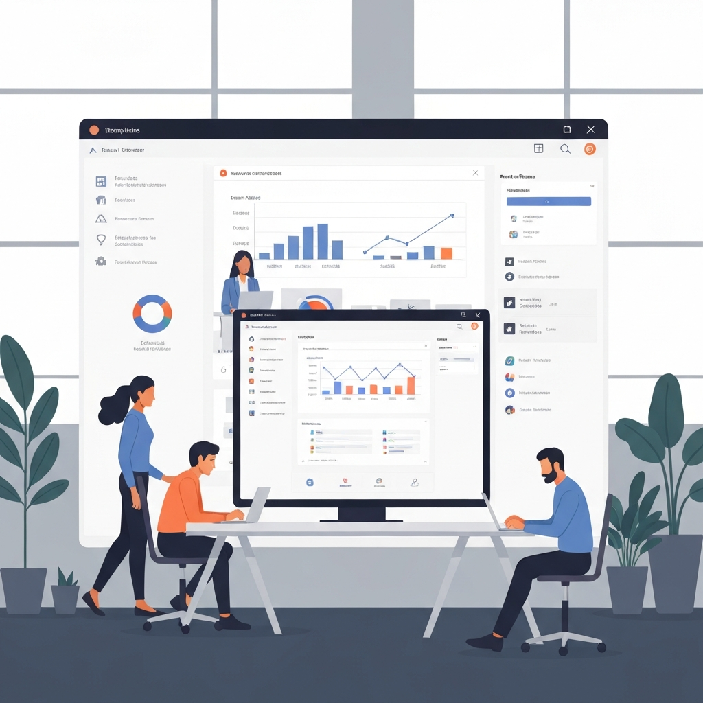
In today's data-driven world, the ability to effectively visualize information is paramount. Data visualization software empowers users to transform raw data into compelling charts, graphs, and interactive dashboards, unlocking hidden patterns and insights. Whether you're a seasoned data scientist or a business professional seeking to communicate complex findings, choosing the right data visualization tool is crucial for success. The sheer volume of options available can be overwhelming, so this guide provides a detailed overview of some of the best data visualization software available, catering to diverse needs and skill levels. Understanding the strengths and weaknesses of each platform allows for smarter data handling and better-informed decisions. We'll delve into the key features, pricing, and use cases to help you make the optimal choice for your specific requirements.
1. Tableau - The Industry Standard
Tableau is widely regarded as one of the leading data visualization platforms, known for its user-friendly interface and powerful analytical capabilities. It enables users to create a wide range of visualizations, from simple bar charts to complex geographical maps and interactive dashboards. Tableau's drag-and-drop interface simplifies the visualization process, allowing users to quickly explore data and identify trends without requiring extensive coding knowledge. This ease of use makes it accessible to both technical and non-technical users, fostering collaboration and data-driven decision-making across organizations.
Tableau offers a variety of licensing options, including Tableau Desktop for individual analysts, Tableau Server for enterprise deployments, and Tableau Online for cloud-based collaboration. For example, a marketing team could use Tableau to track website traffic, campaign performance, and customer demographics, creating visualizations that highlight key performance indicators (KPIs) and areas for improvement. A financial analyst might use Tableau to analyze stock market data, identify investment opportunities, and create interactive dashboards that monitor portfolio performance in real-time. The platform's ability to handle large datasets and connect to a wide range of data sources makes it a versatile tool for various industries and applications.
However, Tableau's extensive feature set and powerful capabilities come at a price. Its licensing costs can be relatively high compared to other data visualization tools, particularly for large organizations requiring multiple licenses. Despite the cost, many businesses find Tableau's analytical power and ease of use well worth the investment. The ROI stems from faster insights, improved decision-making, and better communication of complex data to stakeholders. Tableau's vibrant community and extensive online resources also provide users with ample support and training materials, further enhancing its value proposition.
2. Power BI - Microsoft's Data Visualization Powerhouse
Microsoft Power BI is another popular data visualization platform, known for its tight integration with other Microsoft products and its affordability. It offers a comprehensive set of features for data analysis, visualization, and reporting, making it a strong contender in the market. Power BI's user-friendly interface and intuitive design make it accessible to users of all skill levels, enabling them to quickly create compelling visualizations and dashboards.
- Power BI Desktop: This is the free version of Power BI, allowing users to create and publish reports to the Power BI service. It offers a wide range of visualization options, data connectors, and analytical tools, making it a powerful tool for individual analysts. For instance, a sales manager could use Power BI Desktop to analyze sales data, identify top-performing products and regions, and create reports that track progress towards sales targets. This free version helps individuals get started and explore the platform's capabilities without upfront costs.
- Power BI Pro: This paid subscription provides access to advanced features, such as collaboration, data governance, and enhanced data refresh capabilities. It enables users to share reports and dashboards with colleagues, collaborate on data analysis projects, and ensure data accuracy and consistency across the organization. An example of this is a project team using Power BI Pro to collaboratively develop a dashboard that tracks project milestones, resource allocation, and budget performance. They can share the dashboard with stakeholders and ensure that everyone is working with the same data.
- Power BI Premium: This is the enterprise-grade version of Power BI, offering dedicated resources, advanced analytics capabilities, and support for large-scale deployments. It is designed for organizations with demanding data processing needs and a need for high availability and performance. For example, a large financial institution might use Power BI Premium to analyze vast amounts of transaction data, detect fraudulent activity, and generate reports that comply with regulatory requirements. The dedicated resources and advanced analytics capabilities ensure that the platform can handle the demanding workloads and provide timely insights.
3. Python Libraries - The Coding Approach to Visualization
For data scientists and analysts comfortable with coding, Python offers a powerful and flexible alternative for data visualization. Libraries like Matplotlib, Seaborn, and Plotly provide a wide range of visualization options, from static charts and graphs to interactive plots and dashboards.
Matplotlib is the foundational library for creating static, animated, and interactive visualizations in Python. It provides a wide range of plotting options, including line plots, scatter plots, bar charts, histograms, and more. Matplotlib's flexibility and control over plot elements make it a popular choice for creating publication-quality figures. A researcher might use Matplotlib to create a scatter plot that shows the relationship between two variables, annotating the plot with labels, titles, and legends to clearly communicate the findings.
Seaborn builds on top of Matplotlib, providing a higher-level interface for creating statistical graphics. It offers a variety of pre-built plot types that are specifically designed for visualizing statistical relationships and distributions. Seaborn's aesthetic appeal and ease of use make it a popular choice for creating informative and visually appealing visualizations. A data analyst might use Seaborn to create a box plot that compares the distributions of different groups, highlighting the median, quartiles, and outliers for each group. The plot can be customized with color palettes and annotations to enhance its visual appeal and clarity.
Plotly is a library for creating interactive, web-based visualizations in Python. It offers a wide range of plot types, including 3D plots, geographic maps, and interactive dashboards. Plotly's interactivity allows users to explore data in more detail, zoom in on specific regions, and drill down into underlying data points. A business intelligence analyst might use Plotly to create an interactive dashboard that tracks key performance indicators (KPIs) over time. Users can interact with the dashboard to filter data, explore trends, and drill down into specific areas of interest. The interactive nature of Plotly visualizations makes them ideal for exploring complex datasets and communicating insights to a wider audience.
🔗 Recommended Reading
20260323-AI-Powered-Marketing-Automation-Tools-A-Comprehensive-Guide
Conclusion
Choosing the right data visualization software is a critical decision that can significantly impact your ability to extract meaningful insights from data. Tableau offers a robust and user-friendly platform with a wide range of visualization options, while Power BI provides a cost-effective alternative with seamless integration with Microsoft products. For those comfortable with coding, Python libraries like Matplotlib, Seaborn, and Plotly offer unparalleled flexibility and control. Evaluating your specific needs, technical skills, and budget constraints is essential in making an informed decision that aligns with your goals.
The field of data visualization is constantly evolving, with new tools and techniques emerging regularly. Staying abreast of these advancements is crucial for maximizing the value of your data and staying competitive in the data-driven landscape. As artificial intelligence and machine learning become increasingly integrated into data visualization platforms, we can expect to see even more powerful and automated insights emerge, further democratizing access to data-driven decision-making.
❓ Frequently Asked Questions (FAQ)
What are the key factors to consider when choosing data visualization software?
When selecting data visualization software, consider factors such as ease of use, available visualization types, data connectivity options, scalability, and pricing. A user-friendly interface can significantly reduce the learning curve and enable users of all skill levels to create compelling visualizations. The software should support a wide range of visualization types, including charts, graphs, maps, and dashboards, to effectively represent different types of data. Moreover, the software should seamlessly connect to various data sources, such as databases, spreadsheets, and cloud services, to facilitate data integration. Finally, consider the software's scalability to handle large datasets and the pricing model to ensure it aligns with your budget.
Is it better to use a dedicated data visualization tool or a programming language like Python?
The choice between using a dedicated data visualization tool and a programming language like Python depends on your technical skills, project requirements, and desired level of customization. Dedicated tools like Tableau and Power BI offer user-friendly interfaces and pre-built visualizations, making them suitable for users with limited coding experience. These tools often provide drag-and-drop functionality and automated features that simplify the visualization process. On the other hand, Python offers greater flexibility and control over visualization elements, allowing you to create custom plots and dashboards tailored to specific needs. Python's extensive libraries, such as Matplotlib, Seaborn, and Plotly, provide a wide range of visualization options and the ability to integrate with other data analysis and machine learning tools. If you have strong programming skills and require a high degree of customization, Python is a powerful choice.
How can I improve the effectiveness of my data visualizations?
To improve the effectiveness of your data visualizations, focus on clarity, simplicity, and relevance. Choose the appropriate visualization type for the data you are presenting, avoiding complex or cluttered charts that can confuse the audience. Use clear and concise labels, titles, and legends to explain the data and highlight key findings. Ensure that the colors and fonts are visually appealing and easy to read. Most importantly, tailor your visualizations to the specific needs and interests of your audience, focusing on the insights that are most relevant to their decision-making process. For instance, a simple bar chart showing sales performance by region might be more effective than a complex 3D plot that is difficult to interpret. By following these principles, you can create visualizations that are not only visually appealing but also informative and actionable.
Tags: #DataVisualization #Software #Tableau #PowerBI #Python #DataAnalysis #BusinessIntelligence